SAP Fundamentals UI Kit
UI Kit includes ready-to-use, state-of-the-art drafts of SAP layouts, patterns and controls in sketch. You are welcome to use the design stencils to visualize your SAP app. They are easy to use and give you a realistic impression of your final design.
UI Kit Bundle
Our UI Kit Bundle includes the Sketch Component Library, Icon Font, 72 Typeface, and a Sketch plugin with step by step instructions in the Release Notes to help update the previous version of the Sketch library.
UI Kit Assets
Sketch File v1.4.3
Our Sketch file has over 30 unique components refined and streamlined to allow any user the ability quickly and effeciently build Fiori 3 interfaces using the Fundamentals design system.

72 Font
SAP 72 font family was designed from the ground up and made it possible to meet SAP's typographic requirements, including - Legibility Enhancements, Font Styles, Brand Voice, Character Set and Language Support.
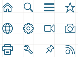
Icon Font
SAP icons have been created with a friendly, yet elegant style that is consistent in terms of size, stroke and balance. The icons are tailored for simple and direct user interaction, using metaphors that are easy to understand.
Sketch Plugin
Symbol Swapper makes it easy to remove your old library, attach a new version, and update all symbols in your document to the newest version in 4 easy steps.
What’s new in v1.4.3?
The Fundamentals UI team is always making improvments to our Sketch UI kit. Keep track of updates in the Release Notes section of the Sketch file.
Updated Menu Structure
Components, Foundation, Page Types, and UI Kit Tools have sub sections for easier access.
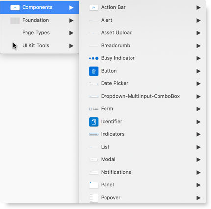
Page Types
We now include Examples & Floorplans to help guide designers with layout, grid and page structure.
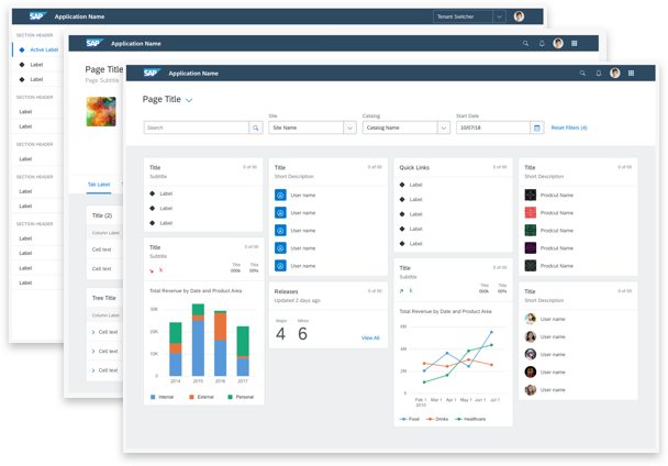
Design system additions & updates
New patterns for colors, type, grid, and spacing make a more cohesive design system.